Output
Navigation
Menu
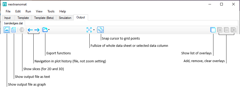
Figure 1.1.19 Menu, containing the most important functions to visualize the output data.
By right-clicking on the active output tab - which shows the output path or filename - you can create additional output tabs, for example to visualize different output directories. However these tasks are quite memory intensive, so use this feature with caution. We recommend to use a single output tab.
Panels for 1D, 2D and 3D
More specific visualization functions have their own panel. (For convenience some of them can be hidden.) Depending on the dimension of a data file, different functionality is available. For example, whether the graph should be represented by a dots or a line is only relevant for 1D data. Color maps and slices are only available for 2D and 3D data. The position and function of the different panels is shown in the following pictures.
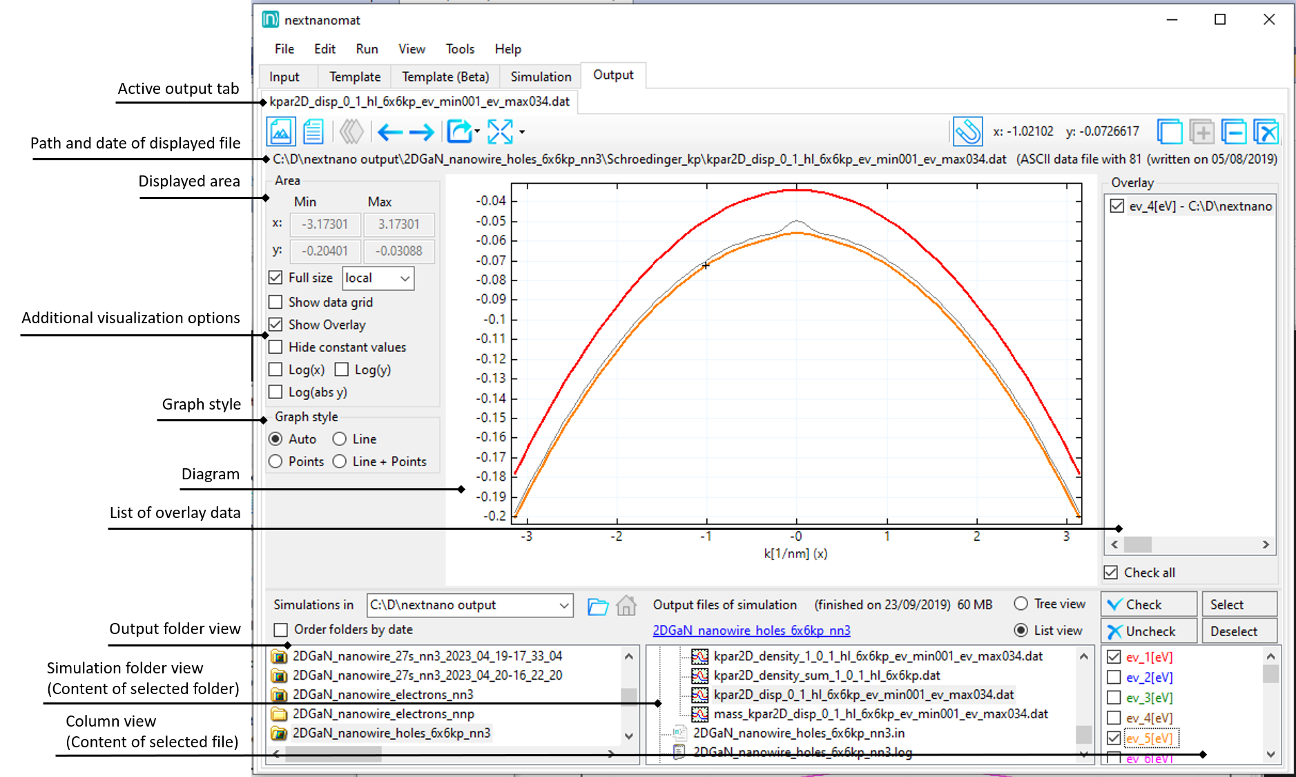
Figure 1.1.20 Panels for a 1D data file
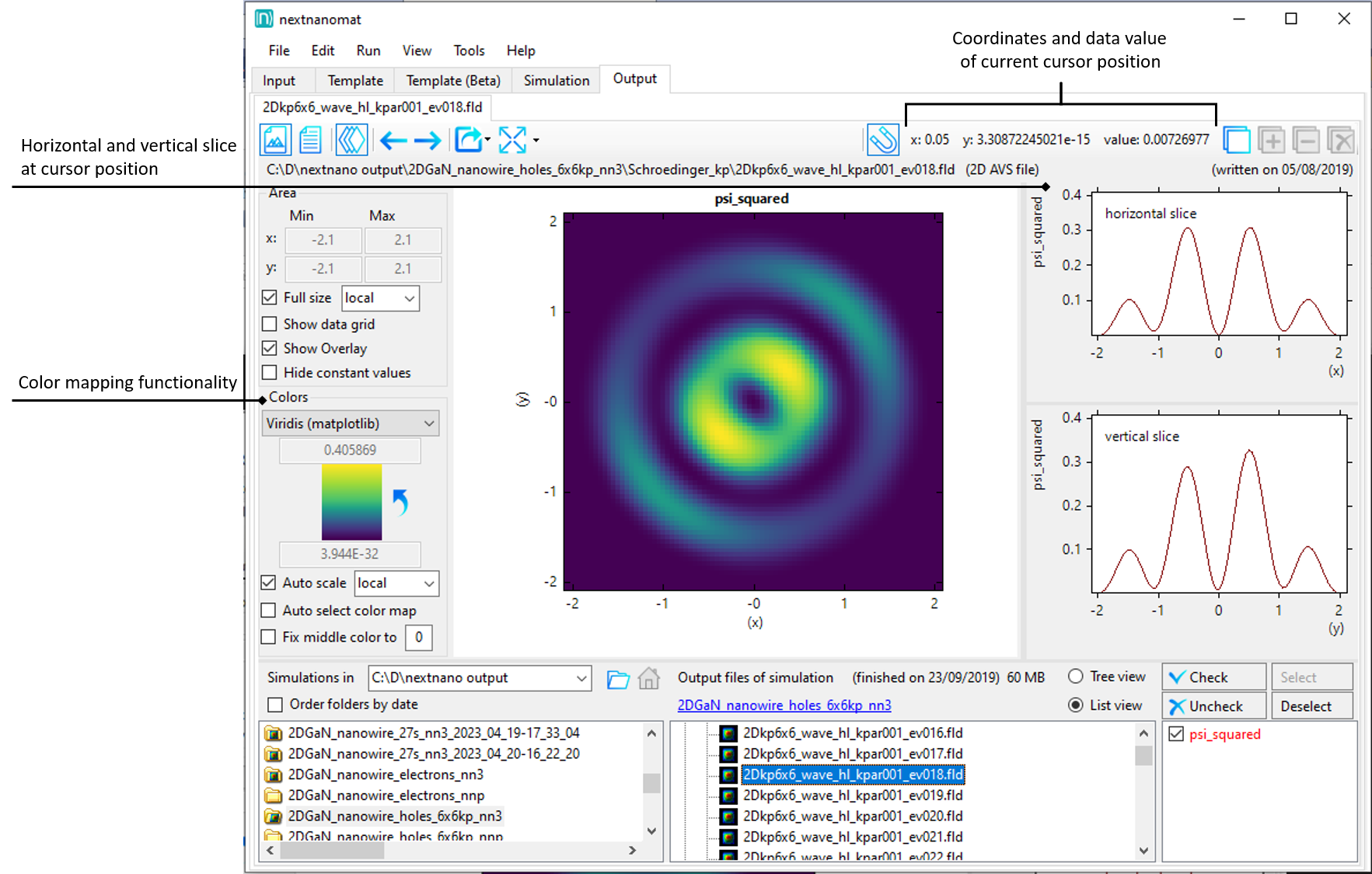
Figure 1.1.21 Panels for a 2D data file
Visualization
Supported Output Formats
The workflow manager nextnanomat can display the following output formats:
- .txt
The file is displayed as a text.
- .dat
The file is displayed as a graph, e.g. scalar field f(x) or vector field F(x)
\(x_1\)
\(f(x_1)\)
\(x_2\)
\(f(x_2)\)
…
\(x_n\)
\(f(x_n)\)
or
\(x_1\)
\(f_1(x_1)\)
\(f_2(x_1)\)
…
\(f_m(x_1)\)
\(x_2\)
\(f_1(x_2)\)
\(f_2(x_2)\)
…
\(f_m(x_2)\)
…
\(x_n\)
\(f_1(x_n)\)
\(f_2(x_n)\)
…
\(f_m(x_n)\)
- .mtx or .mat
Matrix format for e.g. a matrix, a table, a f(x,y) graph. The x and y axes are labeled with integer numbers.
\[ \begin{align}\begin{aligned}\begin{bmatrix} A_{11} & A_{12} & A_{13} & ... & A_{1n}\\ A_{21} & A_{22} & A_{23} & ... & A_{2n}\\ ...\\ A_{m1} & A_{m2} & A_{m3} & ... & A_{mn} \end{bmatrix}\end{aligned}\end{align} \]- .vtr - 2D/3D
Scalar field f(x,y,z) or vector field F(x,y,z). They can be viewed using the ParaView software which is a full 3D visualization software while nextnanomat only displays 2D slices of 3D data files.
- .fld - 1D/2D/3D
Scalar field f(x,y,z) or vector field F(x,y,z)
If a file extension is unknown it is treated as if it were a .txt file.
Text view
If text view is toggled, the content of the selected file is displayed. This view is read-only.
For editing, the file can be exported to a custom texteditor. (We do not recommend to edit data files!)
1D View
Within graph view, one-dimensional data is displayed as curves. Whether data values are represented as points or lines is up to the user. Antialiasing can be switched on or off via View settings. Additionally, the line thickness, background color or the usage of a grid can be customized.
If a data file contains multiple columns, each column is represented by its own curve.
The list of available columns is shown within the column view panel.
Only checked curves will be displayed. Selected curves are highlighted to allow fast recognition of related data.
Helpful features for one-dimensional data visualization are:
2D View
Two-dimensional data is displayed as a heat map, also known as pseudo-coloring. Each value of the two-dimensional grid is mapped to a distinct color. The color difference perceived allows the visual interpretation of value differences. Therefore the change of the color gradient needs to be perceived linearly by the human eye. Some color maps, like the rainbow map, introduce artefacts and have misleading visual perception, which increases the risk for misinterpretaion of scientific data. Find more information about Color maps.
Helpful features for two-dimensional data visualization are:
Gnuplot export of surface plots
3D View
Real three-dimensional plots are not supported by nextnanomat. Instead 2D planes of the 3D data are visualized through heat maps, same as for 2D data. An additional panel allows the selection of the displayed plane (xy, xz or yz) and the position of the slice. This panel can be seen in Figure 1.1.31. If three-dimensional visualization is aimed for, we recommend exporting data to ParaView.
Helpful features for three-dimensional data visualization are:
All of the 2D features
Features
Overlay
For the best experience when visually analyzing the results of the simulation, it is sometimes necessary to look at different files at the same time. We call this the Overlay feature.
Select the plots you want to memorize in the
column viewpanel.Click the
Add to Overlaybutton, see Figure 1.1.22. Alternatively, use the keysa(add) or+(Numpad only).Select another output file.
(optional) add plots of multiple files to the overlay list.
\(\Rightarrow\) Your memorized plots will be displayed in gray on top of the currently selected file.
You can check and edit the content of your overlay in the overlay list panel,
this panel can be shown or hidden by clicking the Show list of overlays button.
Remove selected curves with the Remove from Overlay button, shown in Figure 1.1.22, or use the Del/Entf or d (delete) key on your keyboard.
You can also export the overlay graphs to one combined image file, for further information refer to Gnuplot export.
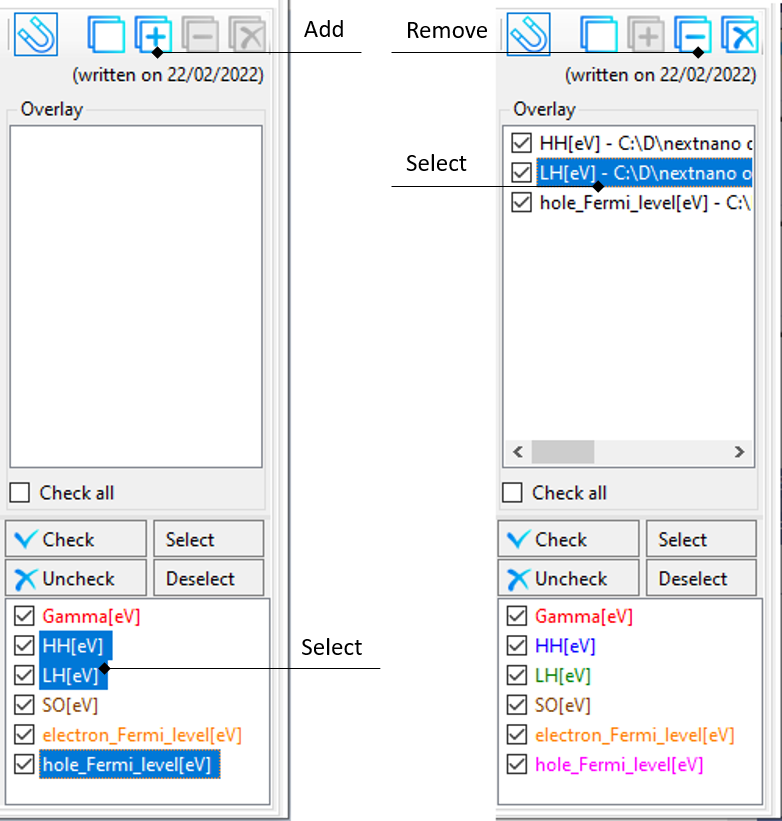
Figure 1.1.22 Workflow to add or remove files from Overlay.
Hide constant values
Note
Be careful when using this feature. We recommend to always disable it after usage.
This feature hides any parts of the curves where the value does not change within 5 grid points (two to the left and right). Its purpose is for visualizing wave functions and probability densities on top of band edges. The constant part which represents the energy level will be hidden. This allows to focus on the changing parts as well as for the underlying band edge to be seen. The influence of this feature can be seen in Figure 1.1.23 and Figure 1.1.24.
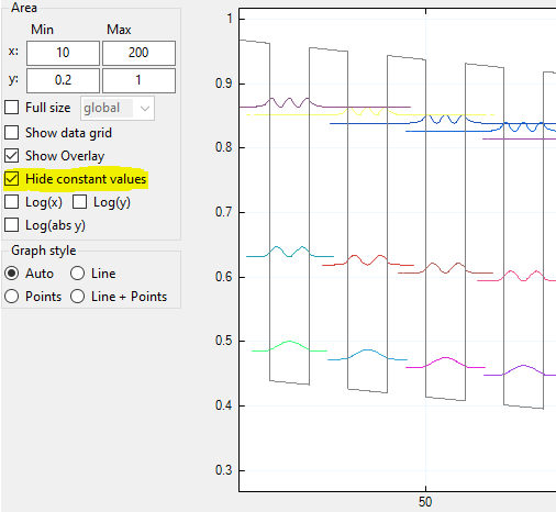
Figure 1.1.23 Hide constant values on.
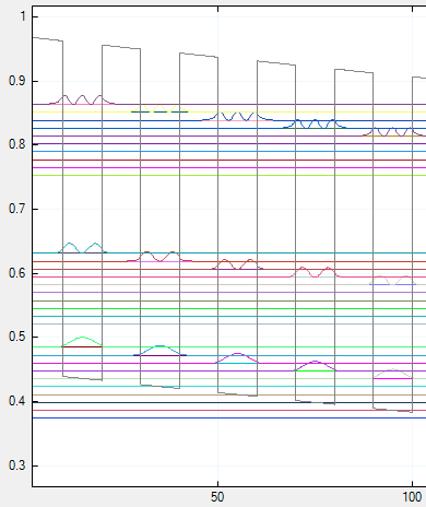
Figure 1.1.24 Hide constant values off.
Show differences
Whenever exactly two columns are selected in the column view panel,
the value difference between these two curves is shown while the mouse is hovered over the data
, see Figure 1.1.25.
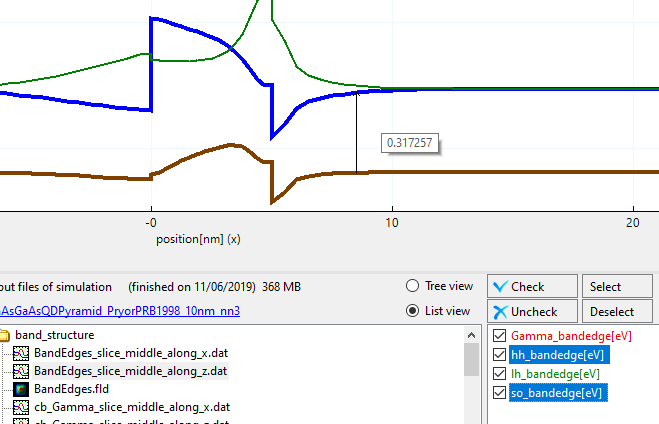
Figure 1.1.25 Arrow showing value difference of two data curves.
Snap to gridpoints
If snap to grid points button is toggled (default: on)
a small cursor cross follows the nearest data curve while the mouse cursor is hovered over the data.
The coordinates and value displayed in the upper right corner of nextnanomat
match the data values of the curve, see Figure 1.1.26.
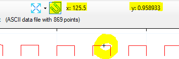
Figure 1.1.26 Snap to grid points feature enabled.
Special fullsize
By using this feature, the view of the output diagram will be matched perfectly to a single graph.
Either the selected graph of the column view,
or it is iterating through all available columns of the currently displayed file.
This feature is useful for example if a file contains multiple columns with a highly different range of values.
Displaying all graphs at the same time (normal fullsize mode) can lead to certain curves appearing to be zero.
By selecting such curve and clicking the special fullsize button, the y-axis limits
are set to its respective minimum and maximum and the curve is displayed correctly.
An example for this use-case can be seen in Figure 1.1.27.
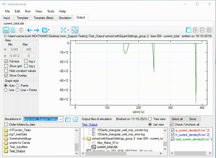
Figure 1.1.27 Special fullsize for a diverging range of values.
Furthermore this feature is also useful for any other file containing more than one column. Iterating through the columns and displaying each curve in its optimal frame, allows for fast and convenient data evaluation, see Figure 1.1.28. .. example one high number of curves
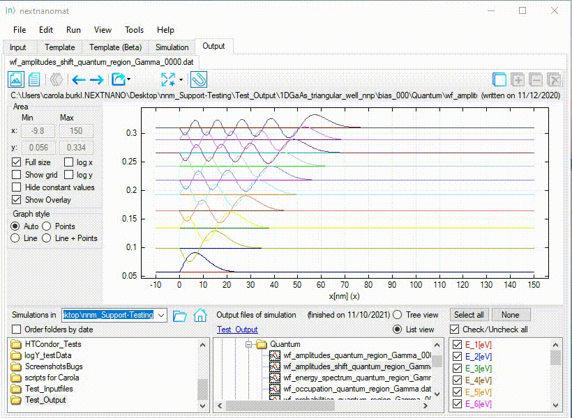
Figure 1.1.28 Special fullsize for a high number of curves.
Auto select color map
If auto selection of a color map is active, a diverging color map is selected for data files spanning from negative to positive values. Else a linear color map is chosen.
Fix middle color to specific value
This feature is aimed for the visualization of diverging data in combination with a diverging color map. It fixes the mapping of the neutral middle color to a specific value and thus ensures a symmetric color representation of diverging data.
Note
To be able to support custom color maps, this feature is not limited to predefined diverging color maps. To avoid unintentional usage we recommend to enable this feature on demand only.
The feature is enabled by checking the corresponding check box. If enabled, it is active whenever a diverging color map is assumed (error prone to enable flexibility) and the data file contains the specified value. Else it is inactive and grayed out. The visual feedback on the activity of the feature can be seen in Figure 1.1.29 and Figure 1.1.30
Example usage of the feature can be seen in Figure 1.1.31.
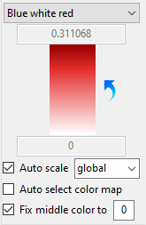
Figure 1.1.29 Enabled and active
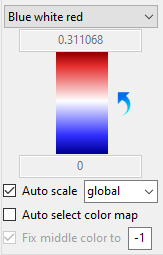
Figure 1.1.30 Enabled but inactive
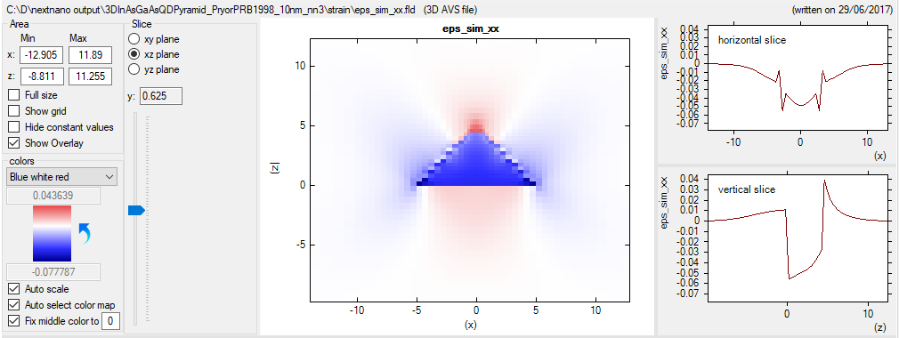
Figure 1.1.31 Visualization of diverging data with fix middle color feature enabled and active.
Export functionality
Most of the export options are available from the context menu (right-click on the visualization).
Some specific options can be accessed from the output menu button Export and Open in specific Format.
For the latter option the custom defined paths to installed applications are used
(with exception of the Gnuplot application). These paths need to be defined in the Data export settings.
You can find a detailed description of the various export mechanism in the section Export Functionalities
Further information
References, you might find helpful…